By looking at the Gutenberg press one can really understand how far we've traveled as a society. Information is so readily available that was not previous centuries. If someone wanted to send a message they could send a single hand written letter.
However, if someone wanted to disperse information to many people it would take much more. Instead of simply thumbing a text to 30 of your friends, or tweeting the news to thousands of people, information had to be put together piece by piece, or placed letter by letter like on the Gutenberg press.
Without the Gutenberg press we would not have mass literacy today. Books had to be hand written so they were very expensive, but once movable type was invented, many copies of books could be made, which lowered the price. Without the availability of books there was no need to learn to read.
If our society only had very few people who knew how to read, the Internet would have not taken off, or would at least be very different today. It would only be a place for wealthy people or scholars to exchange information. Instead the Internet is the common people's voice. A place where no matter who you are, how much money you have, where you are in the world, everyone is on the same level.
Sunday, February 27, 2011
Sunday, February 20, 2011
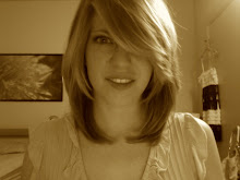
Weekend Pictures


My friends and I baked a red velvet cake from scratch. It was delicious. You can see the top piece is slowly sliding off the bottom piece because the homemade icing is very smooth.
The mushroom picture is from a pot plant of mine. I found the mushroom growing with my geraniums this weekend. It died now, but was there the most of the weekend.
Monday, February 14, 2011
Page Design
Page design defined by Kimball/Hawkins is "the process of placing design objects such as text, headings, and images consistently and effectively on the page, taking into account the actual visual field, the characteristics of the design objects, and the relationships implied among them by the principles of design."
I think it’s important to realize that negative space is also important when considering page design. The design needs to be balanced. This doesn’t mean that is needs to be symmetrical. In fact symmetry might actually be somewhat boring to the viewer.
My design is asymmetrical, but still balanced. The picture takes up 2/3 of the space of the CD, more or less. The text balances out the picture in the other 1/3 of the image. It doesn’t take up as much space as the picture does, but it doesn’t need to. There needs to be more negative space on that side of the image, while still tying in the positive space for balance.
This also works with the hierarchy because the eyes first go to the most prominent thing on the page, being the picture, and end with the words. The picture is what draws the viewer’s eyes to look at the design. The viewer’s looks at the girl, then the swirl on her jacket and end up at the text. This is important, because there is an attention getter, which eventually helps deliver the message that is the text.
The f then connects the text back to the image, so that there is a consistent rotation of the viewer’s eyes. This is achieved by the unity of the arches of the f and the face above. This also adds the meaning on the word after, because of its continuality. The viewer’s eyes continue to connect the image with the text while the word after is also continuous.
Wednesday, February 9, 2011
CD Cover

For my second design I decided to do a CD cover. First I took a picture of my friend, and then I photo shopped it. For the background I painted spray paint onto poster board, and then scanned it onto my computer. I combined the two photos to create the basics for the CD cover.
For the text I wanted the band name “The Here Afters” to stand out, so I chose a font that would draw the eye toward it. When I came across the font I eventually chose the “f” which fit exactly the shape of my friend’s nose on the CD cover. I thought that I might move the font more toward the left because the design element of proximity. Instead I decided that it took away from how well the nose and the “f” went together.
To contrast the band name, I chose a different font for “To Whom it May Concern.” It is a simpler font, as to not draw away the eye from the band name. I also chose a different color for the album title to make the band name contrast more with the background since it is the most important part of the CD cover. I also made sure to align the “To Whom it May Concern” with “The Here Afters” to make reading easier for the eyes. The “f” is obviously also aligned properly with nose.
I also started out with “To Whom it May Concern” in a much bigger font, but instead liked it in the smaller font it ended up in because it was understated. Emotionally, this choice gives the album gives a more solemn, melancholy feel.
The CD has depth to it, just as the CD cover does. There are layers for a reason. I put layers into the spray paint when I painted. There is green as a very base layer, then I put brown on top of that layer. There is gold on top of that. I then took a plastic bag and stuck it on top to bring forward some of the previous layers.
I used repetition by repeating the colors throughout the design. The color that I chose for “To Whom it May Concern” was eye dropped from the chin. The color used for the other font, black, is also repeated throughout the design.
Culturally speaking, this CD cover is for a young adult audience. I created it for a mixed CD that one of my friends made me. This CD has many indie bands, and a lot of music that is for a younger age group. The picture I took also goes well with the audience the CD is meant for. The girl on the cover is actually the one who made the CD. Older audiences probably would not like this CD cover, and therefore it should not be marketed to them.
Rhetorically, CD covers these days are not usually kept. Instead the digital version of that CD cover is. People do not walk through a store anymore, but instead shop online. There is still a need for the CD cover, but not a need to see it in person. There is implied texture, but no need to actually have textured paint on a CD cover that one could touch.
Thursday, February 3, 2011
Three Concepts from Readings
One of the significant concepts I've learned from the reading is Rhetoric. When, where, and how something is used affects this. If you print fliers on an ordinary piece of paper, you are telling people to that they are disposable, and they are more likely to throw them away faster. If you stuck the same information onto a badge, you are indirectly telling them to keep the information and pin it to themselves to share with others.
When designing something you must always think of how it is going to be used. A stapler for example is straight so that we can evenly put pressure onto it when stapling something. Plugs in the wall are lower to the ground, because we know people would rather run wires behind a desk, or along the floor. No one would want to have a plug right next to where the light switch is. It is just way to messy. Doorknobs are the perfect height for the average sized human being to exert the most force to open the door efficiently.
I think another concept that has been brought up looking at how meaning changes throughout culture. Like colors. In China red is worn for a wedding and signifies love. In western society's red means danger or warning, like a stop sign. In western society white is worn for weddings. It symbolizes purity. In eastern societies however it is worn for funerals.
I think the concept of repetition is an interesting one. Like when there is no repetition, but then that is the repetition. You are repeating the fact that you are not repeating anything. However, I think in all designs, no matter when you create. You are repeating something. Whether it's color (even if it's black text) or something else on the page, I feel like most people will end up repeating some aspect of their design. It's not like one would write a paragraph with every word a different color in a different font in bold, italics, and regular.
Subscribe to:
Posts (Atom)