Thursday, January 27, 2011
Design Resume
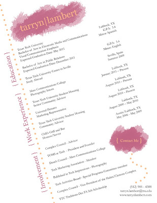
When I start applying for jobs, I want to be remembered. I want my potential employer to stop and look at my resume. I want a design that stands out from all the others, a resume with intriguing qualities.
First, before I even started using InDesign, I made brief sketches of different variations of my resume. My first choice was to slant everything, but I did not know if it would be possible to fit everything I wanted into my resume by doing this. I also knew that I wanted my tarryn|lambert logo on the top portion, so my resume would match my website.
The two prominent colors are from my logo. I took those and repeated them throughout the piece to create a sense of unity and balance. Although my text may look like an ordinary black, it is actually specifically chosen from the picture on my website to add to the repetition and unity throughout different mediums that I’ve created to brand myself.
I used proximity to bring like concepts together. The label education is of course closest to my education, just as work experience is near all the jobs I have held. Within each of those categories there is also different spacing to show which things go together.
For example, I wrote Mass Communication College and Photography Intern in a group with know spacing, so the reader would know I am a photography intern for the College of Mass Communications. I then left a space before writing my next job, so that there would be no confusion.
Although the text is slanted on the page, I still followed the rules of alignment. All the body text on the left hand side is align left; just as all the body text on the right is aligned right. Education, Work Experience, and Involvement are all aligned with each other to show that they are all big categories that one must look for more detail in the body text. There is also the same distance between Education and Work Experience as there is between Work Experience and Involvement.
I used contrast comparing this resume to others, and within the resume itself. There are varying font sizes and colors, as well as text and graphics. Another item that contrasts is the body text. Most of it is left aligned, but there is quite a bit contrasting that is left aligned helping balance the page. There is also contrast between the white negative background and my name.
Logically, a viewer thinks of a resume as the text being straight up and down. At first my resume contradicts logic, but then it is brought back because of the strong alignment in my design.
I also kept in mind the emotional response of my audience. My audience will be potential future employers, so the message I’m sending is extremely important in this one piece of paper. I think my design shows spontaneity without chaos, which describes me well. I can be creative but organized, fun but a hard worker. I also think that this design doesn’t take away from all the activities and jobs I’ve had over the years. It also shows some of my skills, instead of listing them, such as InDesign.
Monday, January 24, 2011
Design Rethink
1. The first one as I mentioned in my previous blog will be redesigning my resume in InDesign. Nothing about that one has particularly changed. The audience will be advertising/ marketing and design agencies.
2. I think I'm going to make a logo or redesign the Outdoor Pursuits Center logo if they have one (which I cannot find), so that I can use it in my #3 ad campaign. The audience for this would be the Texas Tech student body.
3. This one will be involving photography, but instead turning it into an ad campaign. I will take photos of a door in the wilderness, then choose one. Then I will take that photo and on the bottom of it right something like "Mother nature is calling", where the nature part is a different color. Or "Come home to Momma." This will be an advertisement for the outdoor pursuits center. I will stick their logo that I've created on the bottom of the ad as well. The audience will be Tech students. I think this will also get attention of people who would not usually look at an outdoor ad because of the contrast of the ad.
4. I've kind of combined two that I previously had in this one. I will be doing the CD cover, but in order to create it, I will be doing the spray paint art and then scanning it. Then I'll overlay some other image, or photoshop it differently.
5. This is another Ad campaign, and will most likely be interchangeable with one of my other projects if it does not work. It will be an ad campaign for Teddy Grams. There will be two photos. The first one will have two Teddy Grams sitting on the edge of a cup of milk. The second photograph will have one Teddy Gram in the cup of milk and the other on the edge. At the bottom it'll read. Friend Fornever. I think this ad would be geared toward pre teen girls, because they are in the in between stage of child hood (the Teddy Grams) and their teen years (the type of story line).
6. This one will be the wine bottle labels which I talked about in class. I need to talk to a winery first before I know my audience. If no winery will help, I'll be making up my own audience.
Monday, January 17, 2011
5 artifacts proposal
1. Resume - I want to redo my resume in InDesign. I haven't used InDesign that much, so I think this would get me more familiar with it. I think this is also a practical project, because I can then use this resume instead of my current one in word to give to future employers. This would also fulfill one of the principles of design - Alignment.
2. Frame Photography - My vision for this project is to use repetition between images. I want to take picture of people with a frame in different environments. I could also use this project to fulfill proximity, because the frame will be a lot closer to the camera, then what it is framing.
3. Spray Paint - I've always had a liking for street art, especially spray paint graffiti. Obviously I can't graffiti a wall around Lubbock, so instead I would like to purchase poster board, wood, or some other non-pourus material and use spray paint to create a design. I think so much of what we do in design today is through a computer, and I want to be able to do a project that is not. I also think that what is really interesting about spray paint art is the layers, and how you can use different elements that you might find around your house to help create image in your design.
4. Magazine Ad - It hink creating a magazine ad using photoshop. I have yet to decide on what company I'll create this for. The last two projects I have on here are up in the air, because I cannot decide if I want to do this or switch it for what I mention as other options under 5. I could also use some of these concepts below, like the negative space, to put into a magazine ad, or the CD cover. If I do the magazine ad however, I think I would like to try an make it extremely simple. I think I need more practice in making a simple design. I recently created my mom a logo for her company. I think logo's are extremely hard, because of their simplicity. Here's an example a of a simple magazine ad.
5. CD Cover - I think I would like to make a CD cover as I said before. Maybe I could use contrast, or proximity in my design. I think I could also use photoshop for this one, although I might use Illustrator as well. If I don't do a CD cover other ideas to fulfill this last project would be a t-shirt design, photography project on perspectives, negative space project, or a type project.
6. I'm sticking a number six on here, even though I'll obviously be choosing five concepts. Better to have to much than not enough. I think my hardest project will be a wine bottle design. I'll need to think a bit more about this to design it. Maybe I'll talk to a winery in Lubbock.
Sunday, January 16, 2011
Projects for class
After looking at a few portfolios online for graphic design, or communication design, I’ve come up with a few ideas, or projects that we could do in class. I think it would be cool if we design a CD cover. Maybe we could even make mix CD’s with songs on them, and print out our designs for the covers.
Another idea involving design would be for us to make t-shirt designs. We could even do it where you just get a plain white t-shirt and a black sharpie, and you have to draw a design onto it and turn it in, or take a picture of it to turn in.
For one of our last projects we could have a company, or a few different companies come in and describe something they need. Then everyone could go about creating it in his or her own way. Then the company could pick one of the designs and actually use it.
Another project that would be neat would using negative space. If you’ve ever read http://www.27bslash6.com/missy.html, David uses irony to hide Missy in the negative space, because she is missing. These logos are also extremely clever.
Go to my new blog
Go to my new blog at http://tarrynlambert.tumblr.com/. I'll be using this one for a class.
Subscribe to:
Posts (Atom)