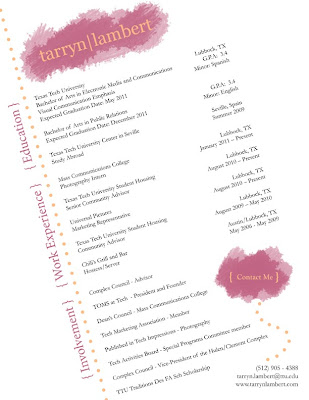
When I start applying for jobs, I want to be remembered. I want my potential employer to stop and look at my resume. I want a design that stands out from all the others, a resume with intriguing qualities.
First, before I even started using InDesign, I made brief sketches of different variations of my resume. My first choice was to slant everything, but I did not know if it would be possible to fit everything I wanted into my resume by doing this. I also knew that I wanted my tarryn|lambert logo on the top portion, so my resume would match my website.
The two prominent colors are from my logo. I took those and repeated them throughout the piece to create a sense of unity and balance. Although my text may look like an ordinary black, it is actually specifically chosen from the picture on my website to add to the repetition and unity throughout different mediums that I’ve created to brand myself.
I used proximity to bring like concepts together. The label education is of course closest to my education, just as work experience is near all the jobs I have held. Within each of those categories there is also different spacing to show which things go together.
For example, I wrote Mass Communication College and Photography Intern in a group with know spacing, so the reader would know I am a photography intern for the College of Mass Communications. I then left a space before writing my next job, so that there would be no confusion.
Although the text is slanted on the page, I still followed the rules of alignment. All the body text on the left hand side is align left; just as all the body text on the right is aligned right. Education, Work Experience, and Involvement are all aligned with each other to show that they are all big categories that one must look for more detail in the body text. There is also the same distance between Education and Work Experience as there is between Work Experience and Involvement.
I used contrast comparing this resume to others, and within the resume itself. There are varying font sizes and colors, as well as text and graphics. Another item that contrasts is the body text. Most of it is left aligned, but there is quite a bit contrasting that is left aligned helping balance the page. There is also contrast between the white negative background and my name.
Logically, a viewer thinks of a resume as the text being straight up and down. At first my resume contradicts logic, but then it is brought back because of the strong alignment in my design.
I also kept in mind the emotional response of my audience. My audience will be potential future employers, so the message I’m sending is extremely important in this one piece of paper. I think my design shows spontaneity without chaos, which describes me well. I can be creative but organized, fun but a hard worker. I also think that this design doesn’t take away from all the activities and jobs I’ve had over the years. It also shows some of my skills, instead of listing them, such as InDesign.

2 comments:
Nice resume! I decided to comment on your resume for this sundays blog post. Here's how the design relates to the rhetorical, cognitive, and affective concepts:
Rhetorical: It is clear that this document and the information on it is correct. Your name is clearly present and after the reader goes to the information they are immediately given the information to contact you. Very clever.
Cognitive: Very Interesting how you were able to keep everything on page. This works especially well with the audience you are trying to impress. The tilt of the words is just right. This catches your eye but it also allows you to read the information correctly. The only thing that made my eye work harder was the section titles.
Affective: Again, the colors you picked for this resume are successful. They don't compete with each other but better yet they don't try to be more important than the information.
Nicely done!
Hey Tarryn. Your resume could be called a shining truth in a sea of foggy mirrors. If you are going for eye-catching, that definitely qualifies!
When looking at your Resume', I can see how you used your design to accomplish a rhetorical task. You use the principles of design that Williams discusses; a design that communicate a message. In this case, the document is well created and therefore is more than the sum of it's parts because you are saying as much by the white space as you are the information
Shrewd. Brilliantly shrewd to use the layout and organization to, not only quickly catch the attention of employers that have grown steadfastly melancholy with the tedium of Microsoft Office template resumes, but to also intentionally direct their focus to end precisely the point you want them to. This point is namely, your contact info.
Not any less impressive is the fact that you've managed to "arouse in the other person an eager want" as the writer,Dale Carnegie, puts it. It communicates confidence as boldly as it does knowledge and experience. Readers.....Employers......Everyone-values and admires confidence.
Post a Comment